Chrome's Vertical Tabs Change How Users Manage Their Workflow
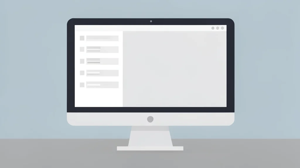
A new layout in Chrome moves tabs to the side, offering a cleaner interface for heavy multitaskers who struggle with crowded top bars.
For many users, browser tabs have become a source of daily friction. As the number of open windows grows, the traditional horizontal strip at the top of the screen becomes cramped and difficult to navigate. Chrome has recently introduced native vertical tabs, moving this list to a sidebar. This shift offers a more spacious way to view active pages, particularly for those who keep dozens of links open at once.
The feature addresses a common pain point where tab titles shrink into tiny icons, making identification slow and error-prone. By arranging tabs vertically, each entry retains a consistent width, allowing users to read full titles without hovering. While this layout has long been available in niche browsers like Arc and Vivaldi, its arrival in Chrome marks a significant update for the mainstream market, removing the need for extensions or workarounds.
Vertical layout solves crowding issues
The primary advantage of the vertical arrangement is stability. In the standard horizontal view, adding new tabs forces existing ones to compress, eventually leaving only small favicons visible. This makes it hard to distinguish between similar sites or articles. The vertical sidebar avoids this compression. Whether a user has ten or fifty tabs open, each item maintains roughly the same amount of space. This consistency allows for quicker scanning and selection, reducing the time spent hunting for specific pages.
For those concerned about screen real estate, the sidebar can be collapsed into a narrow strip showing only icons. This flexibility is particularly useful on smaller laptops where horizontal space is limited. However, the layout shines on wider displays. Since many websites do not utilize the full width of a large monitor, dedicating a portion of that space to a tab list is a logical trade-off. It preserves the vertical space at the top of the window, which is often more critical for viewing content.
Mainstream adoption follows niche trends
While alternative browsers have offered vertical tabs for years, Chrome’s late adoption highlights a broader trend in tech. Users often discover they need a specific interface style only after seeing it implemented elsewhere. According to XDA Developers, Chrome began testing this feature in its Canary channel in late 2025, with a wider rollout occurring in early 2026. This timeline reflects the cautious approach major platforms take when altering core user experiences, preferring to test thoroughly before making such a visible change standard.
The implementation is straightforward for users. Right-clicking the browser window and selecting the option to show tabs vertically triggers the change immediately. There is no complex configuration required. This ease of access removes the barrier that previously required users to install third-party extensions to achieve the same look. The feature is now part of the core interface, ensuring it receives the same level of support and stability as other standard Chrome functions.
Trade-offs for screen space users
Despite the benefits, the vertical layout is not without downsides. The most significant trade-off is the reduction in horizontal width available for web content. On smaller screens or when viewing dense data tables, losing even a small portion of the screen width can be noticeable. Users must decide if the clarity of the tab list outweighs the loss of content space. For many, the answer is yes, but for others working with fixed-width applications, the traditional top bar may remain the superior choice.
Ultimately, the shift to vertical tabs represents a refinement in how browsers handle multitasking. It acknowledges that the traditional model, while functional for light users, struggles under the weight of modern web browsing habits. By offering a built-in alternative, Chrome provides a more organized environment for research and work. The change may feel minor, but for those who live in their browsers, it significantly reduces the cognitive load of managing digital tasks.