iOS 27 Shifts Notification Access to the Top Left Corner
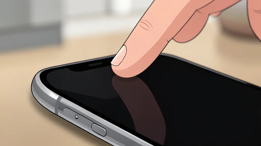
A familiar gesture on iPhone and iPad is changing in iOS 27. Apple is reallocating the central top-edge swipe to trigger Siri, forcing users to adopt a new habit to check their alerts.
For over a decade, swiping down from the top center of an iPhone or iPad screen has been the standard way to access Notification Center. This feature, introduced in 2011, allowed users to view app alerts in a chronological list. With the release of iOS 27 on September 14, Apple is altering this long-standing interaction to prioritize its new Siri AI capabilities.
The change is not optional in the way a setting might be, as the central swipe gesture is now hard-coded to invoke the voice assistant. As reported by 9to5Mac, this shift breaks a significant amount of user muscle memory. The top edge of the display, previously a neutral zone for navigation, is now split between the new AI interface and the traditional control centers.
Central swipe triggers Siri assistant
Once the Siri AI feature is enabled, swiping down from the exact center of the top edge no longer opens the list of notifications. Instead, it activates the new Siri experience. Apple has dedicated the majority of the top edge to this new function, effectively reducing the screen real estate available for other system gestures. This represents a significant shift in how the operating system prioritizes artificial intelligence over quick information retrieval.
Users who rely on the central swipe for checking messages or emails will find their actions intercepted. There is currently no setting to disable this specific gesture for Siri. This means the only way to access notifications via the top edge is to change where the finger is placed on the screen. The trade-off is clear: faster access to AI commands comes at the cost of a familiar notification workflow.
Notifications move to top left
To compensate for the loss of the central gesture, Apple has relocated the entry point for Notification Center. It now opens by swiping down from the top-left corner of the display. On iPad, the area for invoking Siri initially shrank the notification zone in early beta versions, but later builds expanded it to a more uniform region roughly the size of two app columns. This new position aligns the notification access with the top-left corner, mirroring how Control Center is accessed from the top-right.
The visual cue for this change is subtle but distinct. Alerts now animate into view from the left side rather than the center. This design choice guides users toward the smaller surface area dedicated to notifications. While this creates a more organized top-edge layout, it requires users to consciously aim for the corner rather than the middle, a small but persistent adjustment in daily usage.
Users must rebuild muscle memory
The primary drawback of this update is the disruption to established habits. After fifteen years of consistent behavior, the central swipe is deeply ingrained in how many people interact with their devices. Early feedback suggests that while users are impressed by the improved Siri capabilities, the forced change in gesture is a point of friction. Without an option to revert the central swipe to its previous function, users must simply learn a new way to check their alerts.
This is not the first time Apple has altered these gestures, having moved Control Center to the top-right corner with the iPhone X. However, the shift for Notification Center is more profound because it affects the most frequent, low-stakes interaction on the device. For some, the convenience of a faster Siri launch may outweigh the effort of relearning where to swipe. For others, the loss of the familiar central gesture may feel like a net negative, regardless of the AI improvements. The true test will be how quickly users adapt to this new, split-top-edge layout in their daily routines.