Replacing the Google TV Home Screen for a Cleaner Experience
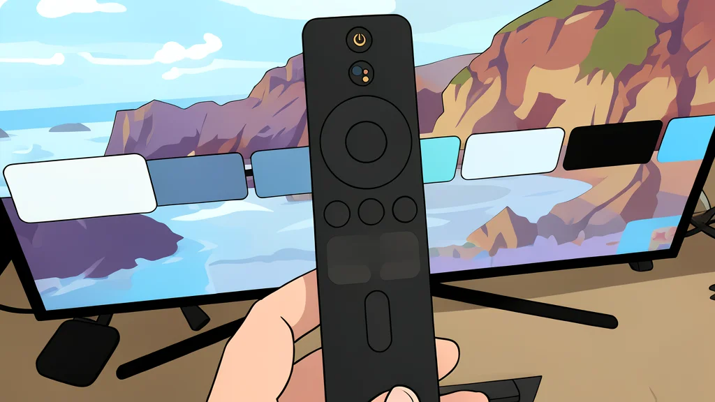
A switch to a third-party launcher removes clutter and ads, offering a more direct path to streaming apps without losing core features.
The default interface of the Google TV streaming box often prioritizes promotional content over user convenience. Many owners find themselves scrolling past irrelevant series recommendations and pre-installed applications that they rarely use. This layout can make accessing specific apps or settings feel like a tedious process rather than a seamless one.
A recent report from XDA Developers highlights a shift by users who replaced the standard home screen with a third-party tool. The change results in a cleaner interface that focuses on the apps a viewer actually wants to use. By removing the visual noise of constant suggestions, the device becomes a more direct tool for entertainment.
Standard interfaces often bury useful features
The primary complaint against the default setup is the allocation of screen space. Large panels dedicated to content recommendations dominate the view, often pushing frequently used apps to the bottom of the list. These suggestions are frequently generic, promoting new releases from streaming services rather than reflecting a user's specific viewing history.
Navigating the system requires several steps to reach desired functions. The settings menu is divided across multiple icons, making it difficult to locate specific configurations like network settings or app management. This fragmented design forces users to memorize complex navigation paths to perform simple tasks.
Alternative launchers simplify navigation and access
Third-party launchers, such as Projectivy, offer a streamlined alternative by allowing users to curate their home screen. Installation is straightforward through the standard app store, requiring no complex technical setup. Users can choose which applications appear prominently, effectively hiding the clutter of unused software.
This customization creates a more efficient workflow. The home screen becomes a direct list of frequently used services, eliminating the need to scroll through promotional banners. Additionally, system settings become more accessible, reducing the friction involved in managing Wi-Fi connections or updating applications.
Core functionality remains fully intact
Switching launchers does not compromise the underlying capabilities of the device. Features such as Chromecast functionality and Google Photos screensavers continue to operate normally. The launcher acts as a front-end layer, modifying the visual interface without altering the core operating system.
Users retain access to all standard streaming and media features while enjoying a more personalized environment. The trade-off is minimal, as the primary change is cosmetic and navigational. This approach allows for a cleaner experience without sacrificing the robust ecosystem that made the platform popular in the first place.