Windows 11 Lock Screen Gets a Cleaner Default Look
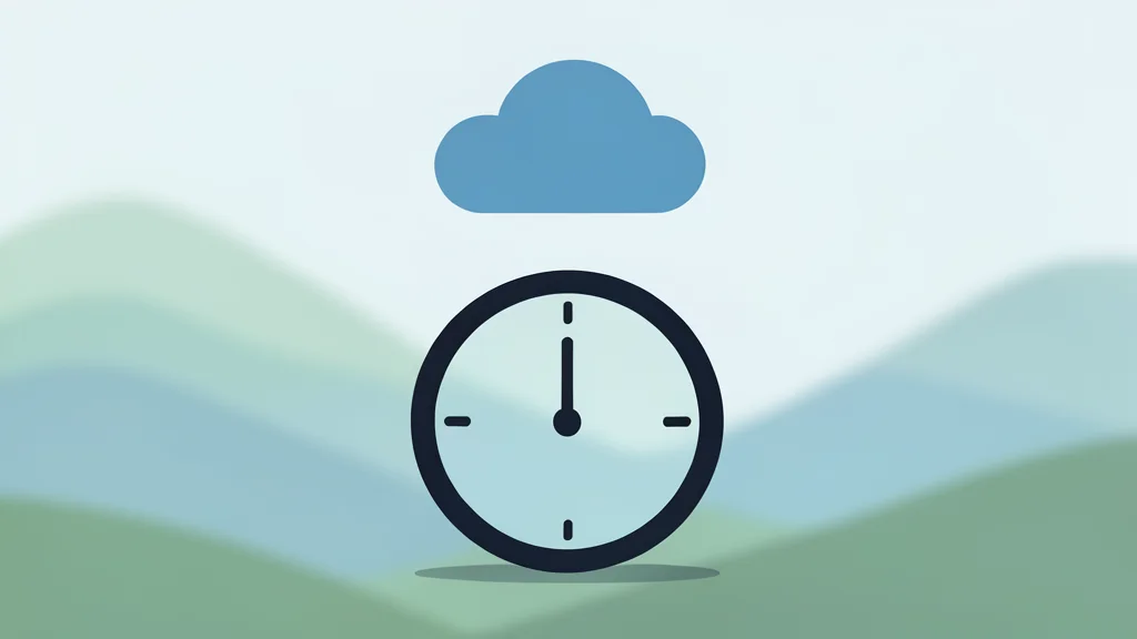
Microsoft is removing the default widget clutter from Windows 11, leaving only the clock, date, and weather to let the background image breathe.
For years, the default Windows 11 lock screen has been a crowded space. By default, it displayed a stack of widgets covering sports scores, financial updates, and news feeds, often obscuring the scenic background image that many users prefer. These elements required manual effort to remove, creating friction for anyone who wanted a simpler, more personal desktop experience. Now, Microsoft appears to have addressed this common complaint by stripping the interface down to its most basic components.
According to reports from XDA Developers, the new default setup is significantly quieter. The screen now displays only the time, the date, and the local weather forecast. The rest of the display area is left clear, allowing the user’s chosen background wallpaper to take center stage. This shift moves the operating system away from a content-heavy dashboard toward a cleaner, more minimalist aesthetic that prioritizes visual calm over information density.
The trade-off for minimalism
While the cleaner look appeals to design sensibilities, it comes with a functional trade-off. Users who previously relied on the lock screen to quickly glance at stock prices or sports scores without unlocking their PC will lose that immediate access. Those specific data points are no longer present by default. If you need that information, you must re-enable the widgets manually or use a third-party app to restore those features. The default experience is now optimized for aesthetics rather than utility.
Part of a broader cleanup
This change is not an isolated decision but part of a larger internal initiative known as Windows K2. This effort focuses on rolling back features that users have consistently disliked or found intrusive. Recent moves in this direction include removing Copilot from core applications and allowing greater customization of the Start menu. The lock screen update fits this pattern, signaling a strategic pivot toward respecting user preferences for a less cluttered interface.
What this means for users
For the average user, this update simplifies the first thing they see when turning on their computer. The reduction in visual noise makes the lock screen feel more like a digital frame and less like a news ticker. However, power users who customized their lock screens heavily may notice little difference, as they likely already disabled these widgets. The primary benefit is for those who have not yet personalized their setup, offering a more pleasant default state without requiring technical knowledge to achieve.